Gamers usually didn't see the business side of the industry. It occasionally bordered on the crappy. This site showcases those works of art. Updates appear on Wednesdays.
Friday, 26 August 2011
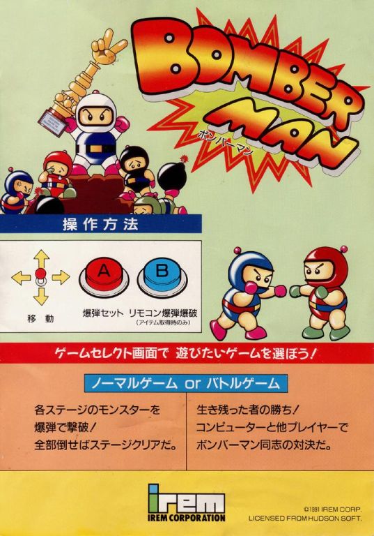
Atomic Punk (1991, Irem America Corp via Hudson Soft)
For whatever reason that anime didn't get mainstream attention in the 1980s, there seemed to be an associated fear that youth wouldn't purchase a foreign product unless an American artist was instructed to Americanize a Japanese design. Sometimes that tactic works, and sometimes it doesn't.
I would consider the flyer for Atomic Punk to be a success art-wise, but a failure in gameplay instructability.
It's like the artist saw nothing except for a few screenshots while composing this image. The grid on the floor, a multi-coloured rogues gallery, a laughing demon sun, and an evil-looking wizard. Yet all of these pale in comparison to one key element of this design.
The children.
"You know", I bet the artist thought, "all of these characters have Lego faces. They look like wall sockets. I think what would sell is if I put children's faces in there instead.
"And not just any faces, but those of photographs I have around the house! My nieces and nephews, immortalized!"
I bet Captain Waffle cried that day, too.
Addendum: In the Land of the Four Fingered, the Purple Villain Child with Five Fingers is King!
Subscribe to:
Post Comments (Atom)


No comments:
Post a Comment